
The Design editor
The editor opens when you open or create a Design. Each Page is a canvas you fill with areas — rectangles that each show one thing: a content source, an image or video, text, a shape, a QR code, or a ticker.
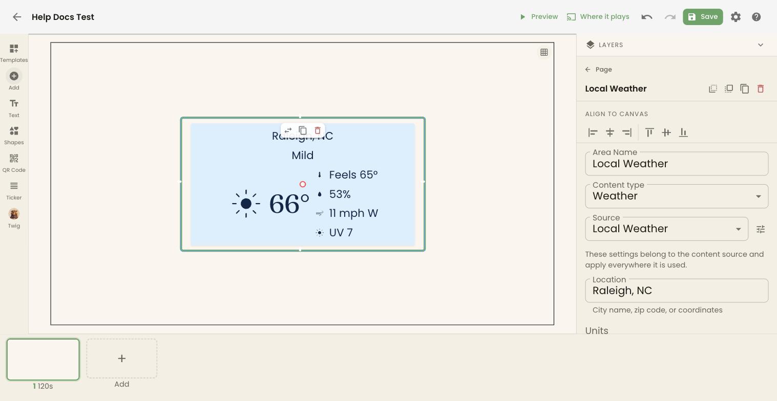
Around the editor
Section titled “Around the editor”- Top bar — back arrow, the Design’s name, Preview, Where it plays, undo and redo, Save, the gear for Design settings, and ? for this article.
- Rail (left) — what you can add to the Page.
- Canvas (middle) — the Page you’re editing, at the screen’s real proportions. The grid button at its top right shows an alignment grid.
- Inspector (right) — settings for the Page, or for the area you’ve selected. Layers at the top lists every area on the Page.
- Page strip (bottom) — the Design’s Pages in the order they play.
On a phone, the rail sits along the bottom, the inspector opens as a sheet, and undo, redo, Where it plays, and settings move into the ⋯ menu.
Add to a Page
Section titled “Add to a Page”| Rail button | What it adds |
|---|---|
| Templates | Replaces the Page with a ready-made arrangement. If the Page already has areas, you’re asked Replace this Page’s content? first. |
| Add | Opens Add content: your library and anything new. See below. |
| Text | A text area in your brand’s fonts. |
| Shapes | A shape in your brand’s colors. |
| QR Code | A QR code that links to an address you choose. |
| Ticker | A scrolling bar along the bottom — one of your own tickers or a built-in feed. Paid plans only. |
| Twig | Opens Twig, which can build or change the Page for you. |
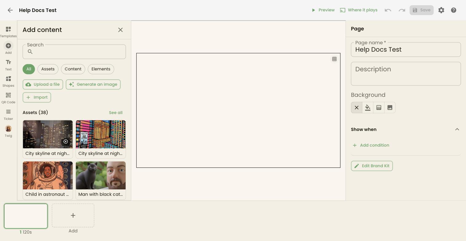
Add content has a Search box and four filters — All, Assets, Content, and Elements:
- Assets — your images and videos. Upload a file, Generate an image with AI Studio, or Import from Canva, Google Photos, Apple Photos, or Pexels.
- Content — your content sources, such as weather, calendars, and menus, and below them every type you haven’t set up yet, each with Set up.
- Elements — stickers, animations, and other decorations.
Click an item to drop it on the Page. See all opens the full list for a section.
Arrange areas
Section titled “Arrange areas”Click an area to select it. Then:
- drag it to move it, and drag its handles to resize it;
- use the small bar above it to Replace what it shows, Duplicate it, or Delete it;
- use the buttons beside its name in the inspector to send it backward or bring it forward, when areas overlap;
- use Align to canvas to line it up with the Page’s edges or centre;
- type exact numbers under Position & Size.
Click an empty part of the canvas, or Page at the top of the inspector, to go back to the Page’s settings.
Area settings
Section titled “Area settings”With an area selected, the inspector shows:
- Area Name, for finding it in Layers.
- Content type and Source — what the area shows. The settings under the source, such as a weather location, belong to the source itself and change it everywhere it’s used. The button beside Source opens the source’s full settings.
- Styling — Header Font, Body Font, Weight, Line Height, Letter spacing, Text Color, Effects, an Area background, and Opacity. Fonts and colors start from your brand kit; change them here for just this area.
- Show when — see below.
Text effects
Section titled “Text effects”The Effects section lets you style and shape your text: a Style and a Shape combine, and Shape and Letter spacing are for Text areas.
Styles:
- Plain removes all effects.
- Outline draws a crisp stroke around each letter.
- Hollow draws letters as an outline in your text colour.
- Shadow adds a soft dark drop shadow.
- Neon adds a glow in your text colour.
- Gradient fills text with a smooth colour blend.
- Pop gives letters a bold dimensional pop-out style.
Shapes:
- Normal keeps text in standard straight lines.
- Block sizes every line to fill the area’s width, stacked. It shows one Line spacing slider under the Shape row, from Tight (lines nearly touching) to Loose, and every line still fills the area’s width.
- Curve arches the text, with one Curve slider from -100 to 100 where 100 is a full circle, negative bends downward, and line breaks become spaces.
Letter spacing:
- Letter spacing is adjusted with a slider in the Text section, and text still fits its area. Line Height appears only for Normal text (it is hidden for Block and Curve).
Page settings
Section titled “Page settings”With nothing selected, the inspector shows the Page’s:
- Page name and Description.
- Background — none, a color, a gradient, or an image. Pick from Backgrounds, or tick Tile at natural size to repeat a pattern instead of stretching it.
- Show when — see below.
- Edit Brand Kit — opens your brand’s colors and fonts.
Show when
Section titled “Show when”Show when limits an area, or a whole Page, to certain conditions. Click Add condition and choose Time of day, Day of week, Temperature is above, Temperature is below, or Weather is. A Page or area with conditions shows only while they’re met — a hot-drinks Page only below 50°F, for example.
If every Page in a Design has conditions and none are met, the screen shows Page 1.
Order the Pages
Section titled “Order the Pages”The page strip shows each Page with its number and how long it plays, such as 120s.
- Drag a Page to change the order.
- Click its time to change how long it plays. Pages without their own time use the Design’s default.
- Hover a Page for Duplicate page and Delete page. Deleting takes the Page out of this Design only; it stays under Pages. A Design needs at least one Page.
- A Page used in other Designs is marked as shared. Hover it for Make unique to this design to give this Design its own copy, so your edits here don’t change the others.
Add, at the end of the strip, offers:
- New — a template or a blank Page, the same shape as the Design.
- Browse — the Page Garden: every Page of this shape in your store. Click one to add it. A Page added this way is shared, so editing it changes it everywhere. Each card also has Duplicate and, for Pages not in any Design, Delete.
Changes on the page strip save straight away.
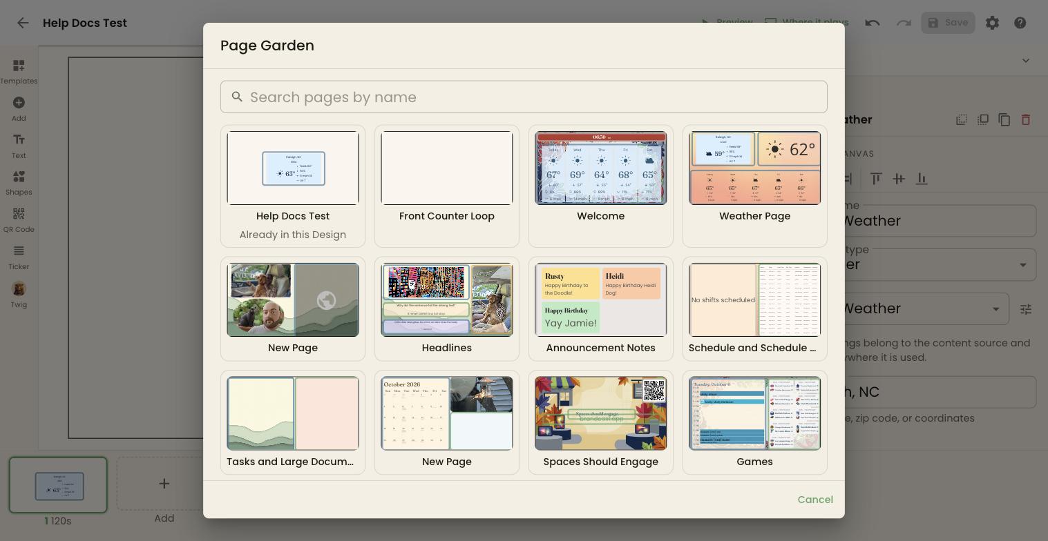
When the Page you’re editing is in more than one Design, the top bar says Used in N Designs — changes apply to all of them.
Design settings
Section titled “Design settings”Click the gear at the top right.
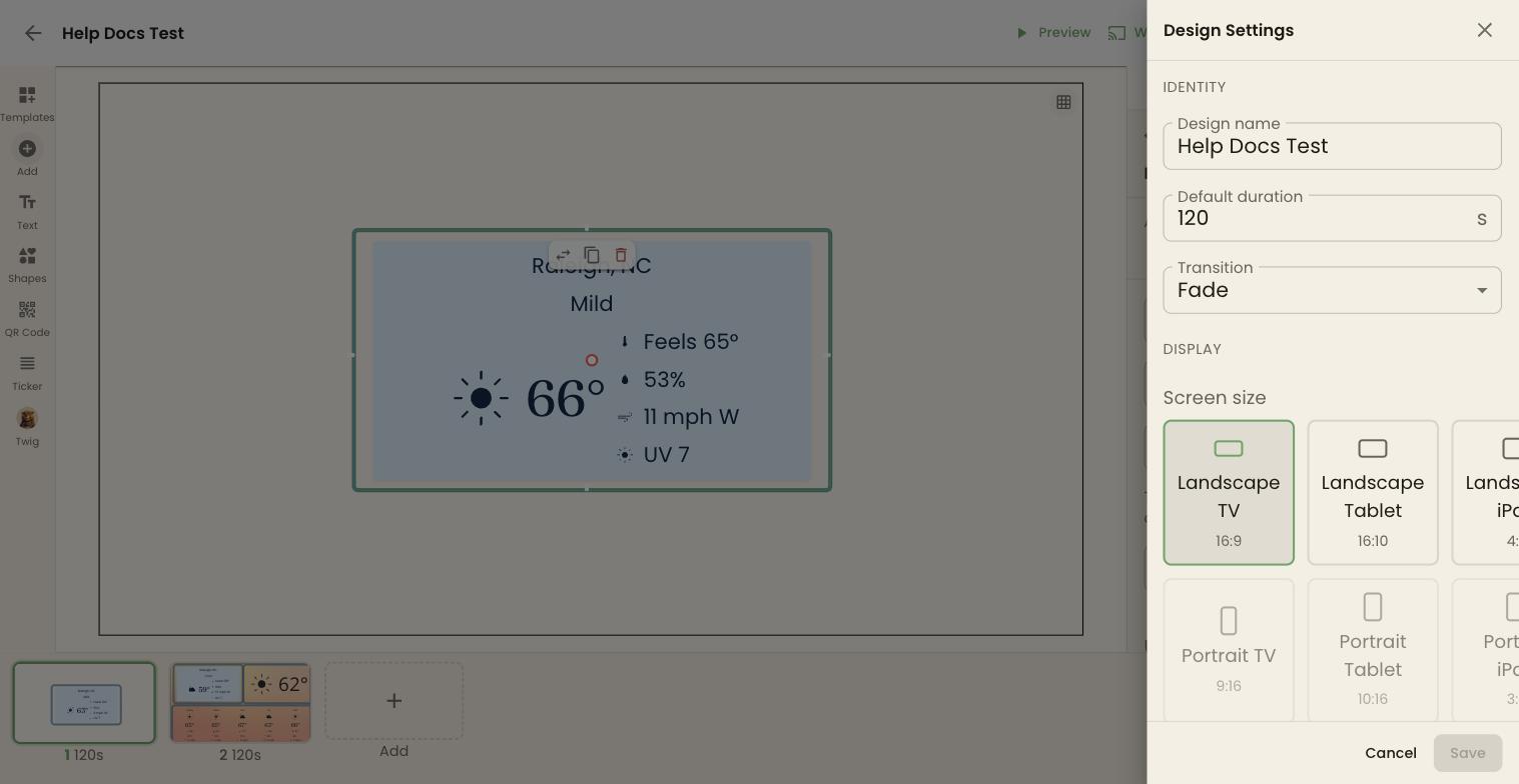
| Setting | What it does |
|---|---|
| Design name | The name shown everywhere. |
| Default duration | Seconds each Page plays unless it has its own time. |
| Transition | How one Page gives way to the next: Fade, Slide, or None. |
| Screen size | Another size in the same orientation. You can’t switch between landscape and portrait. |
| Zone | The zone this Design is for. Screens in other zones won’t offer it on their week calendar. None suits every screen. |
| Emergency Alerts | Shows FEMA alerts — AMBER, weather, and safety — for your store on top of this Design. |
| Appearance | Light or Dark. |
| Accessibility | Off, High Contrast, or Colorblind. |
The name, default duration, and transition save as you change them. Click Save in the panel for the rest.
Preview
Section titled “Preview”Preview plays the Design full screen as a screen would — each Page for its time, with the Design’s transition, looping. Use the arrows or your arrow keys to step through Pages, and the × to close.
Save your work
Section titled “Save your work”Changes to a Page aren’t live until you click Save (or press Cmd+S / Ctrl+S). Saving updates every screen playing the Design within about a minute. There’s no separate publish step.
- Undo and Redo step through your changes, or press Cmd+Z / Ctrl+Z and Cmd+Shift+Z / Ctrl+Y. Cmd+D / Ctrl+D duplicates the selected area.
- If an area is hidden behind another, saving asks This page can’t be read first. Choose Save anyway or go back and fix it.
- If you leave with unsaved changes, BrandCast asks: Stay, Discard, or Save and leave.
Changes Twig makes are saved as it makes them, and the editor shows Page updated by Twig.
Put the Design on a screen
Section titled “Put the Design on a screen”Click Where it plays to choose screens and times. See Scheduling Designs on screens.